All 32 World Cup kits ranked from best to worst

Charlie Crowhurst
You want to look like France (seriously!), and if you're Ecuadorian, our sympathies.

Every four years, the eyes of the world turn to one nation's pitches for a global celebration of soccer as 32 teams battle it out for the sport's ultimate prize. With so much attention being paid to those giving it their all on the grass, the various companies that supply equipment to the individual teams all must do their best to stand out. That is much easier said than done with the kits that the 32 competitors will wear in Brazil.
With other equipment, such as boots, the manufacturers can make them stand out with new patterns or bright colors, but when it comes to kits, tradition often rules. Like clubs, countries have their own specific visual cues that have been established over decades to become instantly recognizable. Messing with tradition is out of the question, and thus it is up to the likes of Nike, adidas, Puma, Burrda, Lotto, Uhlsport, Joma and Marathon to take tradition and repackage it without offending the teams' respective audiences.
For the 2014 World Cup in Brazil, each of the 32 teams will wear at least two kits, one home and one away, with a few of the nations also having their kit man bring a third uniform along for the ride. This ranking is based on the nation's identity as a whole with a subjective look at the home and away kits, judging the strength of each of the competitors based on a combination of the two. The third kits from the likes of Brazil andBelgium have not been included in the ranking because their appearances in the competition will be just about nonexistent.
1. France
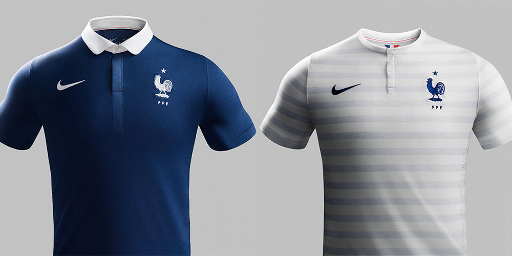
France's home and away kits for the World Cup are, in a word, sublime. Classic styling inspired by quintessentially French elements make for a pair of beautiful kits that look sensational both on and off the pitch. Also important: a kit cannot quit, headbutt or flip off a manager.
2. Holland
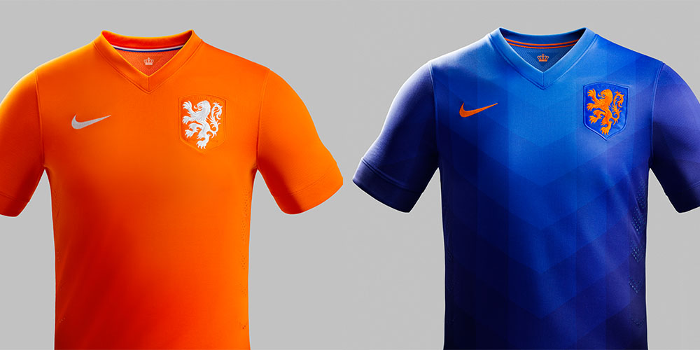
Much like France's pair of kits, Holland's home kit is a masterpiece that uses clean elements that pop with die Oranje's traditional colors. Where the home kit is inspired by the past, the away kit looks more geared for the future with a subtle geometric pattern running down the body. The Dutch are the only team that can pull off orange.
3. Germany

Germany's home kit features a chevron on the chest that loosely recalls the design of the 1990 World Cup-winning West Germay side in a shirt that is radically different from Germany's past few efforts. The away kit, featuring broad horizontal red-and-black stripes with silver detailing and a rugby-style collar, simply looks great.
4. Croatia
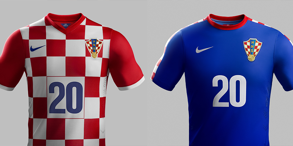
It is difficult to make Croatia's red-and-white checkerboard motif look bad. Nike's home kit for the country lets the nation's style speak for itself. The away kit keeps the country's traditional pattern in the background, but it works phenomenally well as an accent element.
5. Argentina
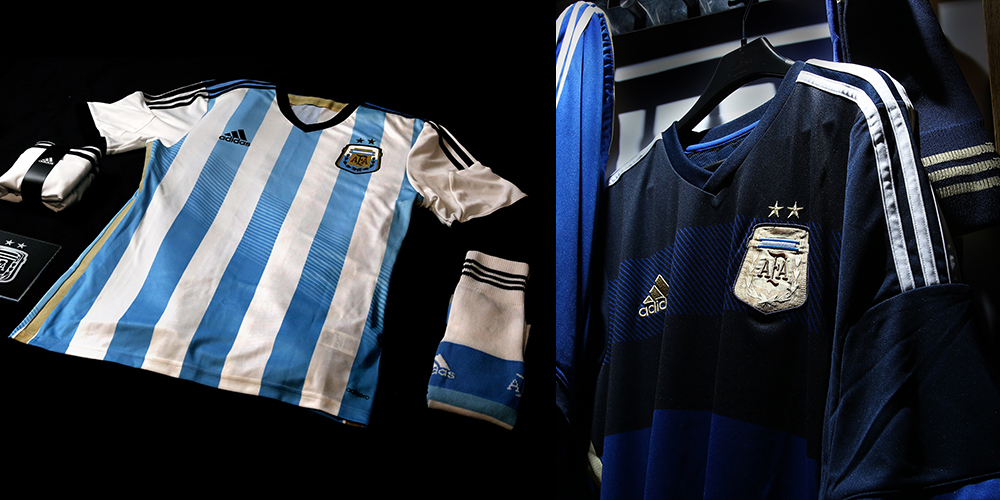
Argentina's classic Albiceleste stripes are accented with gold and black. The stripes get slightly lighter at the bottom half of the shirt, adding a modern twist to a classic look. The away shirt, like Germany's, uses thick horizontal stripes, albeit in a more subtle design. There is variation in the shirt as you move down, and it looks fantastic.
6. Greece
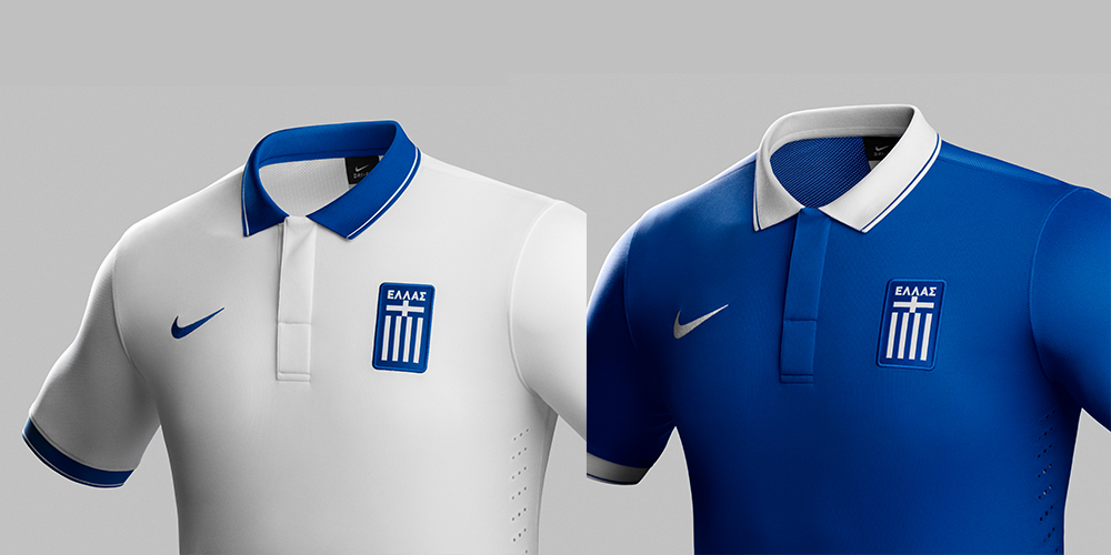
The pair of shirts that Greece will wear in the World Cup are a pleasant surprise. Both shirts use the same template but the alternating colors between the body, cuffs, and collar when combined with the nation's colors make for a pair of strong and clean kits, which is good, because their soccer doesn't offer anything worth looking at.
7. Australia
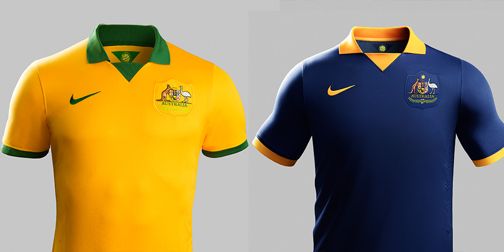
Like Greece, Australia will come with a pair of collared shirts that use the same template. Both shirts are undeniably classy and use a template that won over a lot of people during the club season when it was used by the likes of Atlético Madrid and PSV Eindhoven. They also get the added benefit of being worn by Australians.
8. Korea
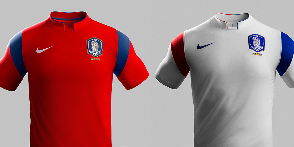
South Korea's kits draw inspiration from traditional Asian attire, the Taegeuk symbol and the nation's flag. With a unique collar and asymmetric elements on the sleeves, the away shirt adds that extra something that the home kit was missing and lets the pair really stand out from the middle of the pack.
9. Uruguay
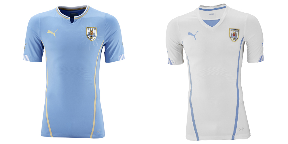
La Celeste mark Puma's first appearance on the list as we make our way out of the World Cup kit top tier. The home shirt is nice, featuring the club's traditional sky blue color with white and gold accents, but the pair is let down by the unremarkable white away kit. Puma's kits will be skin-tight on the players but hopefully most of the fans will have stayed away from the top-of-the-line shirts and gone for the looser-fitting replicas, but even that can't fix a faux deep V.
10. Italy
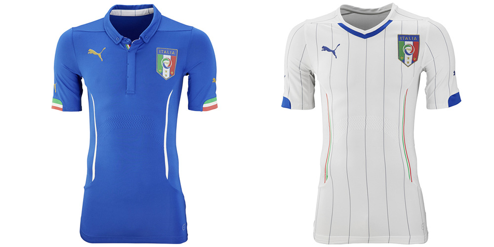
Gli Azzurri's wonderful home kit looks really good with its simple and understated design. The away kit, unfortunately, is a bit on the ugly side thanks to a mix of pinstripes with broad vertical lines that don't do each other any favors.
11. Spain
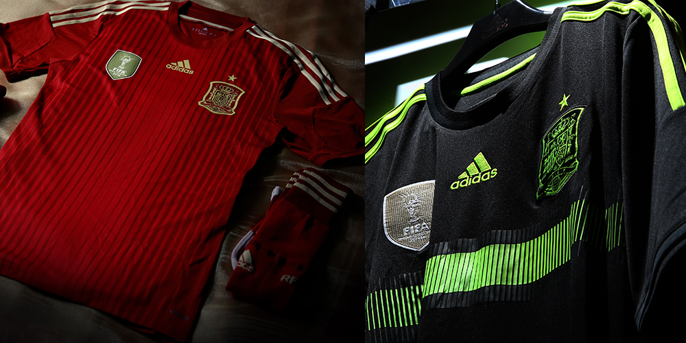
Spain's home kit features a beautiful design that ditches the blue color that the country have used over the last few years. It is elegant, and the design choices are fit for the reigning champions. The away shirt looks like something they would wear in training instead of in a match, but they're better in training than most are in a match, so that's not too bad.
12. Brazil
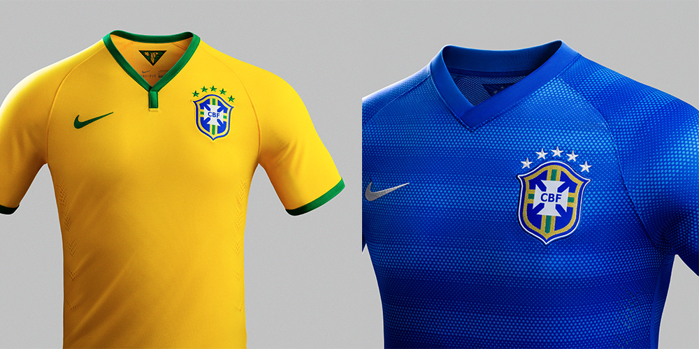
The host country's home kit is reminiscent of an old training shirt template that Nike used in the mid-2000s. The shirt is well-designed in its own right, but against the rest of the pack, it fails to stand out. The away kit, with its subtle hoops, is one of Nike's most unique designs in years. It's a shame we won't see much of it at the tournament.
13. United States
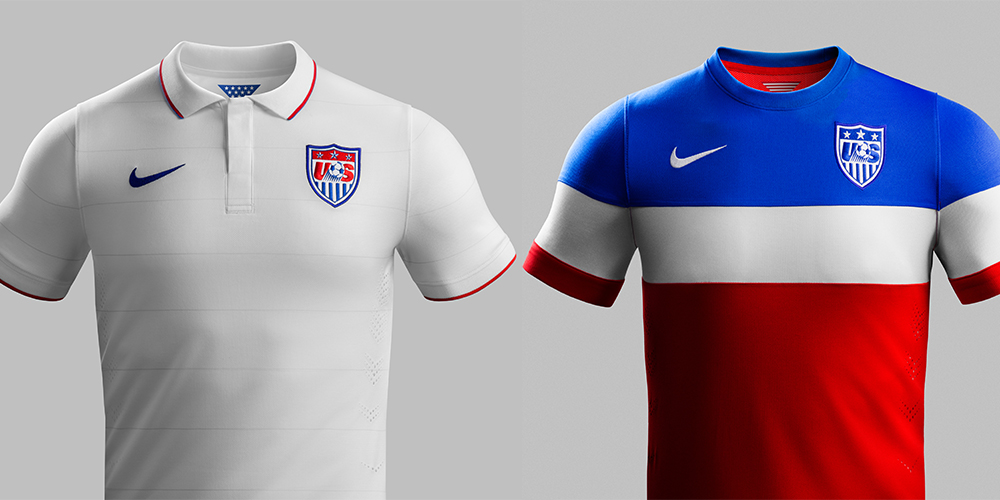
Like Brazil's shirt, the USMNT home kit is well designed with nice, subtle details. It uses the same kit as Greece's but the monotone look holds it back. The away shirt is a good one, but the US is ultimately held back by the competition and the weight you will put on eating 1,000 bomb pops this summer.
14. Portugal
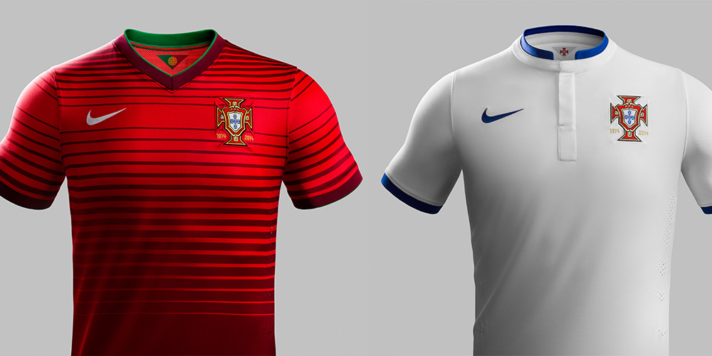
Portugal's home kit uses much less green this time around with hoops that increase in width as the shirt moves down. The away kit is reminiscent of Manchester United's 2012/13 alternate in that it is very plain.
15. Ghana
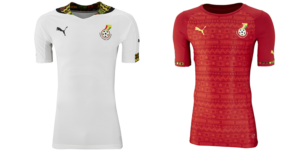
Of all of the African nations, Ghana's pair of kits are the best. Like most of the other work that Puma did for the continent, the Black Stars' white home kit features some great bursts of color inspired by Ghanaian tradition. The away kit carries those design elements forward, wrapping the whole shirt in the pattern.
16. Chile
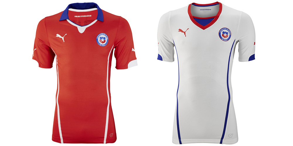
Chile's kits are very much in the middle of the pack. Both efforts are cleanly designed, but they are also boring when you look at the rest of the field. The away shirt is the same template as Uruguay's away and suffers from the same issues, namely the faux deep V. Seriously, who thought that was a good idea?
17. England
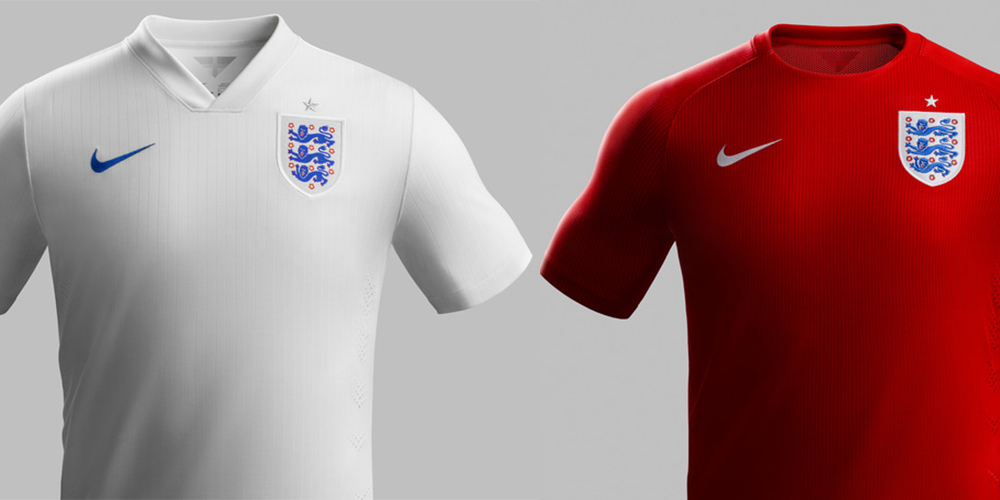
The Three Lions' kits are just about as inoffensive as possible in that they are very plain. The details are limited to vertical pinstripes, and that's about it. The kits carry the clean designs that Umbro started doing around 2010, but the changes might just be too few to make them noticeable.
18. Japan
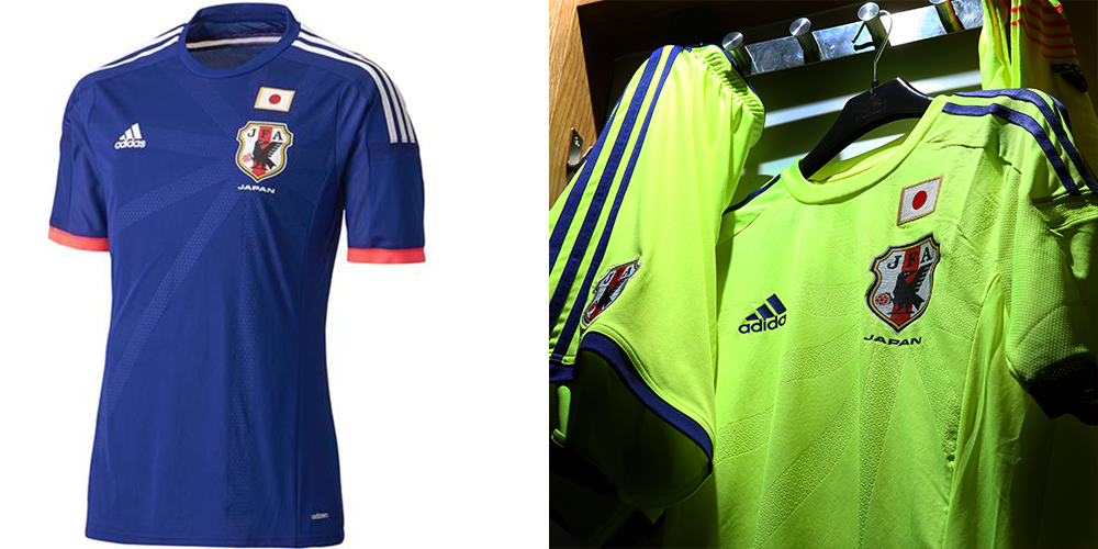
Japan's home kit is undoubtedly the better of the pair. The blue shirt features rays emanating from the center of the crest in all directions with red detailing to really drive the point home. However, as with Spain's away kit, the bright green number that Japan will wear would look at home on the training pitch, and they're not good enough to pull off such a silly look.
19. Switzerland

Switzerland's home kits from Puma are uninteresting at best. The red home shirt has a nice cross detail in the center of the chest but that is all that helps it stand out. The away shirt, like those from Uruguay and Chile, is unremarkable in its design. True to their history, Switzerland just don't want to stand out.
20. Russia

The home kit features an elegant design that ultimately looks good. Unfortunately for Russia, the pair is let down by the away kit. The white shirt features a blue arc at the top of the chest that is a reference to the curvature of the Earth as seen by Yuri Gagarin in space. But this is the World Cup, and after a few beers you're not thinking about space. You're thinking it looks like some drunk tie-dye that you attempted in your backyard.
21. Colombia
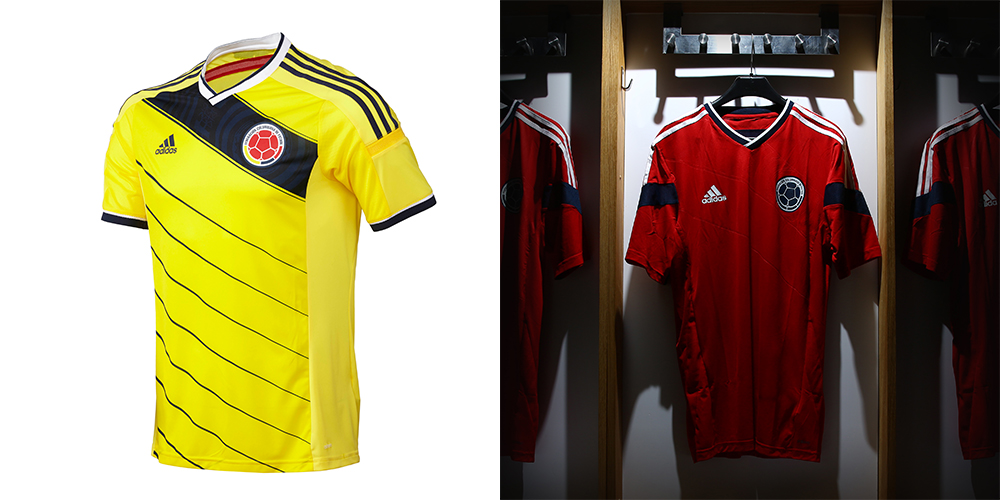
Colombia's home shirt with the country's traditional yellow color and diagonal navy blue stripes is one of the tournament's better and most underrated shirts. But then there's that away kit of nothingness.
22. Belgium

The tournament's dark horses represent Burrda's first (and possibly last) trip to the World Cup with a pair of shirts that look as though you could find them hanging in a counterfeit shirt vendor's stand on the way to the ground — where you still wouldn't buy one for $10. Belgium will move to Adidas after the tournament.
23. Mexico

Up until this tournament, Adidas' work for Mexico had been phenomenal. The home and away shirts feature zig-zag designs that unfortunately don't scream "Mexico." They do scream "AYSO District 9 Mighty Lightning." It is also a shame that they went away from the elegant black away shirts of the last few years in favor of an overly bright orange look.
24. Ivory Coast
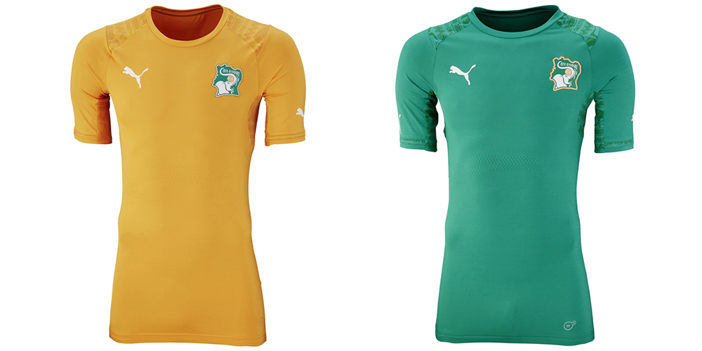
The Elephants come with a pair of clean designs from Puma that use the same template. There is a traditional pattern on each set of shoulders. Unlike Ghana's home kit, Côte d'Ivoire's are monotone against the country's already bright colors and thus don't stand out nearly enough. You're nicknamed the Elephants, and this is the best you can do?
25. Honduras
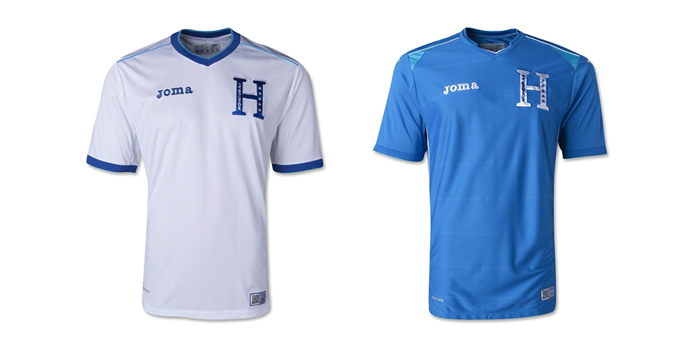
This isn't Joma's first time at the World Cup, but it sure looks like it. Honduras' kits are boring and both look like training shirts that didn't have much thought put into them.
26. Nigeria
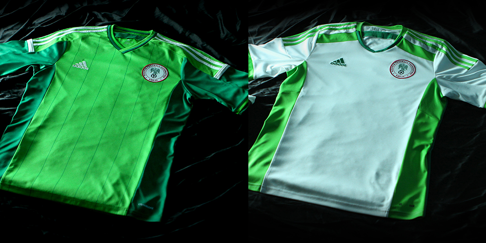
It seems as though Adidas have always had problems with Nigeria's kits. The country had always worn plain green uniforms that looked straight out of a catalog. This time around, they thankfully don't look like boring templates, but the color choices of a bright, almost neon green really let Nigeria down both home and away. Neon green is never a good idea.
27. Cameroon
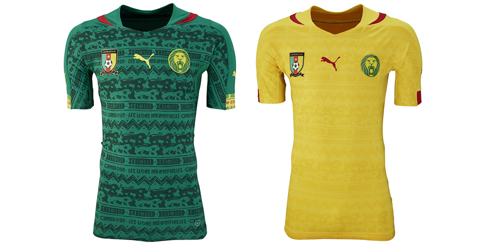
Cameroon's kits suffer from the same issues that Côte d'Ivoire's did. They use the same template with monotone patterns. Unfortunately for Cameroon, the home kit is a bit too obvious and would actually look better from a more understated design. That the Indomitable Lions don't have the best kit in the tournament is a travesty. Their nickname alone demands it.
28. Bosnia and Herzegovina
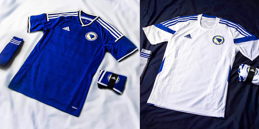
Bosnia's new home and away kits were announced by Adidas with just over a week to go until the tournament. Because of that, there really wasn't enough time for the company to give the country anything special, and that left Bosnia and Herzegovina in a pair of plain template kits that suffer from the same issues as Colombia's away. The good news is that this is Bosnia's first World Cup ever, so Adidas could have put out a t-shirt with a drawn on badge and fans would have bought them.
29. Algeria
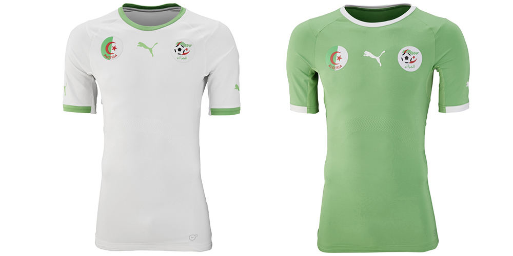
This is the worst of Puma's 16 World Cup kits for 2014, simply because they are boring and bereft of any detail. Algeria's shade of green is one of the nicest colors at the tournament, but it doesn't do enough to make either of the kits stand out. The good news is that they don't figure to last long in the tournament.
30. Costa Rica

Costa Rica's kits are centered a swooping symbol on the chest that doesn't look like it means much of anything. The shirts are the same template with the colors switched up, but they still look unattractive and out of date at the same time. It's so ugly that it's almost impressive.
31. Iran
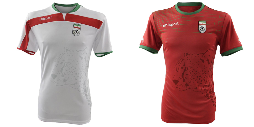
Iran's home shirt features an asymmetrical design that looks lopsided, while the away kit would be right at home with the 2004 Portugal side. The faint sublimated Asiatic cheetah that appears on both shirts also doesn't do much to add to the claims that these home and away kits belong in 2014. On top of that, Iran had formally complained about the quality of the shirts and have said that they were simply not designed or built for the conditions that the team will face in Brazil, so they have nothing going for them.
32. Ecuador
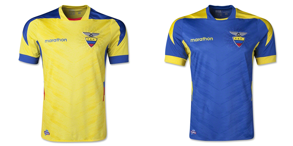
Last, and most certainly least, is Ecuador. Marathon's home and away kits feature outdated styling that would have looked natural on the baggier shirts of the 2002 World Cup. Yes, they are better than Ecuador's other recent kits, but that doesn't really say much. There are some really good ways to incorporate yellow, blue and red into designs — see Romania andCrystal Palace for examples — but that simply is not the case here. Burn them.


No comments:
Post a Comment